Theme Experience (THX) in core WordPress

For the past couple releases of WordPress I had the privilege of working on revamping the admin theme screens, probably my biggest core contribution since developing Twenty Eleven. Working on the WordPress.com theme showcase was one of the first side projects I did at Automattic, when we were just Lance, Ian and me on the Theme Team; and I’ve worked on the many iterations since then, so I’m glad I could bring part of that knowledge to help improve the core theme screens.

The project was initially called THX38 and started as a plugin during the 3.8 release cycle. After some user tests we settled on a complete revamp of the experience, using client side technologies to make it faster and more responsive. The design removed most of the text in the screen, allowing people to focus primarily on the theme screenshots. (I’m personally fond of the arrow navigation system that lets you browse themes casually with the keyboard — maybe coffee cup in the other hand. It’s a somewhat relaxing way of looking at themes.)

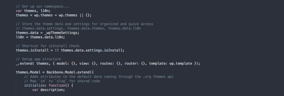
It uses Backbone.js to power the client side code, something many parts of the WordPress administration panels are starting to leverage. It’s a good bridge between the robustness of the current server side codebase and more dynamic technologies to help achieve better user experiences on the client — things like searching for an installed theme is instant. We managed to get this in very close to the release deadline. Another positive result is we ended up with leaner code than before, something that would help with future improvements.

For 3.9 (just released, go grab it or upgrade!) I worked on using the same architecture and UX to power the install-themes screen, which wasn’t touched in 3.8. This meant interacting with the .org API for querying themes. Again, this made it just in time. The end result is a faster and image focused browsing experience, that also paves the way for future iterations in the versions to come. That’s something I really like — we’ve now had two subsequent releases improving core aspects of the theme experience. This agile process aligns with the momentum that core WordPress development has been gaining since the last few releases, with rapid cycles during the year, and we are looking at even more improvements around multiple screenshots, filtering system, etc. We now have a solid base for it.

Thanks to everyone that helped getting this out there, during every milestone we passed — and my special gratitude to Shaun, Andrew and Gregory.

Tonesque

During hack day—a day devoted to trying things and exploring ideas at Automattic—I created Tonesque, a script that allows you to get an average color representation from an image. It’s inspired by the Duotone theme, but I wanted to make something much easier to integrate with any theme. It also uses a bit of a different color processing logic. I’m putting it to test here for my image posts to see how well it behaves.

A new tale on a past idea

Once again, time to move things around here and continue, with a renewed, dustless canvas, evolving a design that was started a while before. I have since removed most of the javascript but kept the direction initiated with the trilogue experiment intact, for the most part. The win being less time spent when navigating the different content sections and a more tight, balanced design. Also a brilliant excuse to work on hacking Toolbox yet again.

With this attempt, I strive to make the reading experience a tad more focused. I also got to redesign the picture gallery display with something more flexible and appealing —to me, naturally—, while still making use of WordPress core galleries.

The less friction towards content input should mean, theoretically, more content in the end; or perhaps better content. (That has proven to be a great value with the picture gallery, since it is quite easy to upload a new picture and populate that section without having to edit any code at all.)

Another point that encouraged this housekeeping was that the balance among javascript, CSS, and content was starting to feel constricted, impending further changes to the website. It was turning into a crystal tower for which any addition was a lure for catastrophes.

Note: If you have previously left a comment around here, my apologies on keeping it on the still-pending noria. That was in part due to the unfinished, precarious state of the respond section.

Trilogue

On the past two iterations of this website I turned from a Tim Van Damme presentation –still viewable on my portfolio– to the usual bearings of a blog layout. Both worked fine, looked nice and I were, for the most part, pretty fond of them. However, I began missing one when viewing the other and the experience derived into something which seemed too disjointed for my pleasure. I also felt I wanted a more prominent place for my photography which was kind of buried down after the second iteration.

So a few weeks back I started drawing some initial mockups of what would become an idea to combine those views. The first visual element I constructed was the navigation: writing, portfolio and photography, as those were the three main areas I wanted to showcase upfront on the site –hence the name of this post.

Trilogue mockup

I wanted a clean design given that I would be adding real time switching from one section to the other and it needed to feel responsive and smooth (or as responsive and smooth as it could get) without detracting the viewer. The navigation laid out the foundation for the main composite elements of the design: the boxes. They would structure the different places of the front page and new interface buttons could be created for different functionality with ease and consistency.

Furthermore, it also allowed me to experiment with colors while the grand picture evolves around white-space: the frame responsible for setting the tone. The breath allowed by the areas of the design with no elements placed connected fine with the text and boxes.

By far, the most challenging effort was designing the different instances so as to only require a minimum animation to switch from one to the other (I am still mangling with it, though). The idea was that the pacing should follow the flow as if the site slightly rearranges itself to accommodate the content it will display as in a continuum that remains organic to the overall experience. Just from the start I declined the option of having the entire site working this way; I opted instead to display only the last post on the front and connect that to the main blog logistic.

I wanted to leave most of the animation on the CSS and use jQuery just to switch classes and add or remove markup. The added markup would trigger the new CSS and (on Safari and Firefox 4 at least) execute the desired animation. I believe it works quite well and allows for quick changes in the placing of elements and their animation without touching the laid functionality and javascript foundation. Having a manageable set of classes and using clever selections was of the utmost importance given that I intend to add some shiny responsiveness in the near future. As a result, I have the markup, the added functionality and the visualization mostly separated, which is good.

For this iteration I started the process on unstylized markup, just polishing the inner-working and the bones of the site. After the main structure was working well I ported it to a pristine Twenty Ten theme which proved to be extremely flexible – I have some hardcoded bits I need to turn into functions. Then I went to add some details around; always an ongoing process. I ended up also experimenting with the addition of a last twitter post to better balance the front page. The gallery is a nice experiment of ease-of-use. I am using the Galleria jQuery plugin and applying it to the output of a WordPress gallery. Now I just need to upload a new image to the gallery and voilá.

There are still plenty of rough edges and areas needing further improvement in order to make the experience as seamless and accessible as it should be. For one, the back button on the browser should take you back when you are on the front page. I have yet to face the issue of touch devices: still thinking on how to display what the three main buttons stands for on those devices deprived of hovering. I have still to make anchors work as direct links and play nicely with the photo gallery. So, if you see anything out of place send me a message or leave a comment around here. And if you have an iPad tell me what behaves or shows wrong.

Over the next few days I plan on finishing what is not working as expected, clear most of the piled up code-clutter and hopefully start on the different sections of the blog which are still severely undeveloped.

A Webkit border carnival

Lately I have been doing some test work with borders and RGBA colors in order to get the effect I am using on this site. The first try I did turn out to be a carnival for Webkit. Anyone knows what that is about? I was using a border width together with some radius and a rgba value. I then resort to tossing the border width and using padding on the wrapper element to overcome this nuisance.

By virtue of design

I have been taking some time to develop a new design and having it properly work as a journal of thoughts. That meant gathering some old writings and shaking the dust out of them, rewriting pieces. Always a good experience. I want to make use of this opportunity to put on words some thoughts about the force behind this iteration and also about design in general. I plan on making this place a sitial for experiment with design while allowing me to write comfortably.

This site works above WordPress and its front design grows around the excellent p2. I wrote before about the state of comments and the outlanders policy on the site and it is time for the pendulum to go steering back to its former place. At the shade of P2, comments are now more blended with the site. It works wonders in Webkit and looks quite good in Firefox. I do not know about the rest of the herd.

As individuals who are deeply involved with design we ought to question from time to time the implicit ideas behind the notions we follow. Some time ago Jason Santa Maria wrote a nice article about proportions and ratios and how they matter to design on the web. Leaving behind all the singularities he writes about, the question leads itself to the actual role and meaning of design. To understand how a medium should deal with design principles we should question how design works in and of itself, because that means how it copes with said principles. Then the inevitable next step are the ancient faces of form and content.

When it comes to my view of form and content I hold content as having its shape –always. And design is, in this sense, the content itself given that it changes the perception of the body of words in a page —what is often and thusly regarded as the content. Design is not about giving a message; it constitutes the very message due to the fact that we perceive the synthesis of the content and its shape. We cannot separate content from design. What we perceive as content is actually the union of the very content and the design that conforms it. I argue that maybe the quest is not to find what new principles the web unleashes, but how the canon of perception may be applied to it and evolve from it.

I do not believe that design is conveying information per se. I believe design is the information and the information is the design as they are molded into one unity; and as one unity they remain so long as the perception takes place. I do not think we can regard the information separate from the design that shapes it –this is, at the moment someone perceives the unity. The thing is that human expression through the web is still conveyed by virtue of perception, and our perception does not elude the guides and rules it has followed throughout time.