

Recently, Vlad Olaru wrote and shared with me a thoughtful piece on the place of themes and the advent of Gutenberg in WordPress. While exchanging impressions via email he encouraged me to share my own more broadly, so here I am, true to the days in which discussion happened across blogs.
Themes, mainly premium ones, have been the integrators of the WordPress world.
This made me smile. I started my WordPress journey with themes years ago. I believe it’s important, while Gutenberg evolves to give better design tools to people, to take the perspective of theme authors for a bit. What does it mean for themes that blocks allow more design tools to be available to users?
The fact themes have been the ones to essentially establish page builders as a paradigm is a testament that their role as “integrators” has pushed the ecosystem forward and lead them to implement — often in idiosyncratic ways — what the WordPress platform wasn’t paying much attention to. Themes have the privilege and responsibility of being the closest to the user and how they experience their site, leading developers, in turn, to try to overcome shortcomings in the customization experience offered by the platform. (The difficulties of making your site look like the demo of a theme are notorious.) However, in solving these issues in a multitude of ways, often incompatible with each other, it contributes to creating a faint locking effect that permeates and hurts the user in the long term. Integration can then become the shackles of inescapable experiences.
Which brings us to the conversation about how the evolution of Gutenberg interacts with themes. There is a difference between standardizing the final interaction point (in our case, the block) and giving all integration decisions to the user (the theme role, in Vlad’s examples). That seems to be the main point of discussion and it’s worth clarifying it: providing consistent integration points through blocks, design tools, etc, shouldn’t mean handling control of the design minutiae to the user, nor removing agency from themes, but instead promoting a common way of expressing site elements that ensures a consistent customization experience.
A lot of the conversations about themes have been cast, perhaps all too eagerly, in doom-colored clouds by focusing on the underlying infrastructure and perceiving the shift at play (giving more tools to users) as one that makes every user responsible for their site design. That shouldn’t be the reality. The role of themes is not really changing. They are still meant to provide template resolvers, design parts, styles, and all its various layout decisions; the only difference is that blocks would be at the center, making things more portable and easier to customize given the editor engine understands them better. Users, in turn, will see a familiar interface for all aspects of their site’s appearance.
Perhaps the only new concept being introduced is patterns. These are design helpers to achieve more difficult layouts or beautiful designs faster, which the theme can also control and provide its own. It can be as simple as a few blocks put together or can encompass a larger area of a page. Since themes are made of blocks, it’d also be feasible to swap parts of it with another. Whether a theme is built through markup, CSS, and PHP templates, or expressed through blocks, patterns, styles, and block templates it’s still the responsibility of the theme to integrate, curate, choose, and prepare the experience in the ways it thinks it can better deliver its possibilities and its safeguards. This is not going away. If anything, it becomes more present.

Actually, the general consensus in Gutenberg is that everyone should “Embrace and enhance users being in control”.
I think this is a mischaracterization lost in the sea of impressions that is the day to day process of developing the main ingredients at play. The question is not about giving all power and responsibility to the user but about absorbing the common so that the specific can be better nurtured. That is, building the design tools that would let users interact with themes and blocks in a coherent manner, and giving themes control over its mechanisms. WordPress should provide a familiar and easy to use platform but it’s also the theme builders (soon also pattern builders), site creators, and so on, the ones that shape the final solutions users will often experience.
The systems that might be implemented (block based themes, a block style system, design tools, etc) are not necessarily to be seen as targeted directly to the end user but to the theme creator as well; and passing through them to the final user. It will remain up to the theme and site creators to decide what should be exposed and in what degree, which might vary from “absolutely nothing” to opening and locking certain aspects of the experience in a controlled and familiar way. The overarching decisions (typography, colors, design balance) should be coming primarily from themes.

If the new editor gets its way, this de-facto packaging standard for distributing whole site solutions to end-users will be gone.
Definitely not! The aim is that it would give better and more supported tools to establish these solutions in ways that are inherently compatible with the platform at large. Standardizing on these design tools should help us integrate and expand a common system but shouldn’t imply taking control away from themes. Quite the contrary, a large part of the work is going into ensuring themes can have overarching control over several visual aspects of blocks.
More to the top, a global system of styling and layout will be (eventually) put at your disposal — again, nice for one part, cognitive-freeze for the other. WordPress is becoming more capable, which is a blessing and a curse.
The styling system is primarily a way to establish a direct relationship between the theme and unaware blocks — that is, blocks that have not been created with a specific theme in mind —, in a way that the platform can recognize as appearance attributes in order to render things accurately while allowing the creation of controls to manipulate them visually on the block interface. But this is something for the theme to ultimately oversee, the same way that having a “theme editor” in the dashboard doesn’t mean it should be exposed to every end-user.
The aim is to provide a better and more integrated engine to power the theme experience, not to expose all its inner workings to all people or make it easy to “ruin a design”. That spectrum should always be in the control of those that provide the final solutions, which could be tightly determined or more open ended, depending on the needs at play.
In the end, WordPress contains multitudes and we ought to design systems that are meaningful to all.
Percy Shelley wrote in A Defence of Poetry that poets were the unacknowledged legislators of the world. To borrow the sentiment, let’s hope themes can be the acknowledged curators of the WordPress world.
Tune in for the first WPBlockTalk tomorrow, a free virtual event with speakers from all across the WordPress community. Matt Mullenweg and I will start by presenting on the latest adventures of Gutenberg and hopefully doing some live demos, so there could be dragons 🐉

It tends to be common in the aching philosophy of our time to hide a treasure and then celebrate its finding as a wondrous discovery of intellect. This error seems particularly prevalent in the world of philosophy of art, where the violence of reason is wielded as a hammer to shape reality.
Arthur Danto, for example, characterized painting — ever since the Renaissance and until the avant-garde movements beginning at the turn of the 19th century — as a practice in the pursuit of increasing realism in art. An imitation of the world seeking always higher degrees of fidelity. What concerned artists, Danto would say, was depicting the world as it looked. This allowed him to state there was a fundamental conceptual shift when art “learned” that it could be more than just imitation.
On principles of Renaissance theory, paintings were windows on the world — pure, apparently transparent openings through which one saw the world as if from outside. So a picture drew its beauty from the world, ideally having none of its own to contribute to what one saw, as it were, through it.
Arthur Danto, Abuse of Beauty, 2002.
Such a resolute conviction in his theoretical model (that illusionism was the primary objective of painting) shows a disregard for the actual reality of art and those that made its history. Leonardo wrote among his notes for a book on painting:
The painter who draws merely by practice and by eye, without any reason, is like a mirror which copies every thing placed in front of it without being conscious of their existence.
Leonardo da Vinci, Treatise on Painting.
It is also evident when looking at some of our greatest painters that the development of their craft was not one of increasing fidelity but often quite the oposite. Their earlier work tends to exhibit more faithful attention towards depicting details of the world than their later work does. At their zenith and the more they dominated the medium, the representation becomes more dynamic, portraying elements with varying degrees of emphasis in a symphony of shapes.
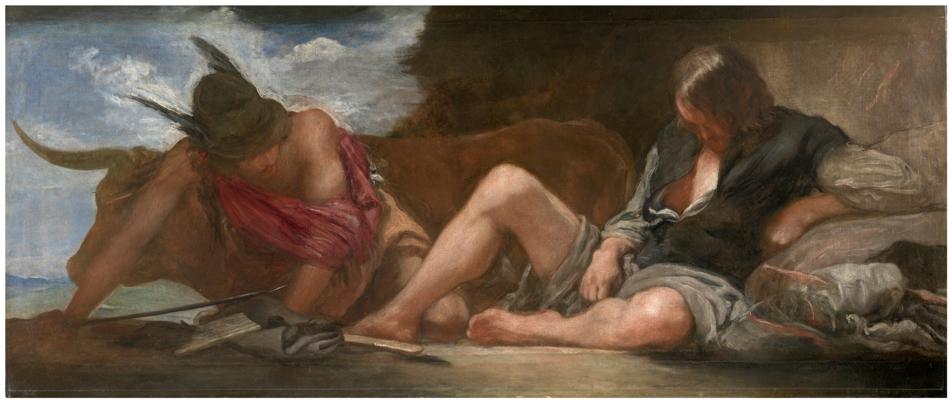
Velázquez final works display this quality with extreme eloquence and sensibility. His forms attain both freshness and aplomb through his extraordinary and varied brushwork. Composition becomes tangibly cinematic built out of impressions of reality. That ability to synthesize and express couldn’t be further away from a quest to depict the world as if paintings were mere mirrors standing in front of it.
Unfortunately, three of his compositions on mythology were lost centuries ago to the fires at the Alcázar of Madrid, with just one remaining: Mercury and Argos. It is a magnificent work that should elude on its own the mischaracterization of mimetic progress as a valid project. It contains that ingredient which eludes the philosopher chasing conceptual simplification: that porosity and style in expression that shine over pale and cold imitation.