It tends to be common in the aching philosophy of our time to hide a treasure and then celebrate its finding as a wondrous discovery of intellect. This error seems particularly prevalent in the world of philosophy of art, where the violence of reason is wielded as a hammer to shape reality.
Arthur Danto, for example, characterized painting — ever since the Renaissance and until the avant-garde movements beginning at the turn of the 19th century — as a practice in the pursuit of increasing realism in art. An imitation of the world seeking always higher degrees of fidelity. What concerned artists, Danto would say, was depicting the world as it looked. This allowed him to state there was a fundamental conceptual shift when art “learned” that it could be more than just imitation.
On principles of Renaissance theory, paintings were windows on the world — pure, apparently transparent openings through which one saw the world as if from outside. So a picture drew its beauty from the world, ideally having none of its own to contribute to what one saw, as it were, through it.
Arthur Danto, Abuse of Beauty, 2002.
Such a resolute conviction in his theoretical model (that illusionism was the primary objective of painting) shows a disregard for the actual reality of art and those that made its history. Leonardo wrote among his notes for a book on painting:
The painter who draws merely by practice and by eye, without any reason, is like a mirror which copies every thing placed in front of it without being conscious of their existence.
Leonardo da Vinci, Treatise on Painting.
It is also evident when looking at some of our greatest painters that the development of their craft was not one of increasing fidelity but often quite the oposite. Their earlier work tends to exhibit more faithful attention towards depicting details of the world than their later work does. At their zenith and the more they dominated the medium, the representation becomes more dynamic, portraying elements with varying degrees of emphasis in a symphony of shapes.
Velázquez final works display this quality with extreme eloquence and sensibility. His forms attain both freshness and aplomb through his extraordinary and varied brushwork. Composition becomes tangibly cinematic built out of impressions of reality. That ability to synthesize and express couldn’t be further away from a quest to depict the world as if paintings were mere mirrors standing in front of it.
Unfortunately, three of his compositions on mythology were lost centuries ago to the fires at the Alcázar of Madrid, with just one remaining: Mercury and Argos. It is a magnificent work that should elude on its own the mischaracterization of mimetic progress as a valid project. It contains that ingredient which eludes the philosopher chasing conceptual simplification: that porosity and style in expression that shine over pale and cold imitation.
How can a system fundamentally evolve without drastically changing? WordPress can build incredible sites, yet the usability and clarity that used to be a driving force for its adoption has been fading away. The present reality is that many people struggle using WordPress as a tool for expression—they struggle to compose richer posts with media, to get their site looking the way they want, to imitate how a theme demo looks, or to set up and customize a store. There is a disconnect between what is edited in a given field somewhere in the interface with how it will look on the real site. WordPress has always been about the user experience, and that needs to continue to evolve under newer demands. Gutenberg is an attempt at fundamentally addressing those needs, based on the idea of content blocks. It’s an attempt to improve how users interact with their content in a fundamentally visual way, while at the same time giving developers the tools to create more fulfilling experiences for the people they are helping.
How can such a vision happen without dismantling, rebuilding, fragmenting, or breaking the WordPress ship that for over a decade has been carrying the thoughts, joys, and livelihoods of millions of people and more than a quarter of the web?
The ship, like Theseus’, needs to continue sailing while we upgrade the materials that make it. It needs to adapt to welcome new people, those that find it too rough to climb on board, too slippery a surface, too unwelcoming a sight, while retaining its essence of liberty. This is not an easy challenge—not in the slightest. Indeed, we called it Gutenberg for a reason, for both its challenges and opportunities, for what it can represent in terms of continuity and change. It is an ambitious project and it needs the whole WordPress community to succeed. I’d like to start examining some of the decisions made along the way, and the ones that are still to come.
Optimize for the user. An early overview for the project described some of the requirements it faced from a document and data structure perspective. Namely, how can we introduce the notion of content blocks in a way that is transparent to the existing ecosystem while allowing us to rapidly iterate on what ultimately matters the most—the user experience. This means being able to start using Gutenberg very early on without losing access to your content (opening it in other editors, for instance) and without changing how rendering the document works. The overall principle has been to let the machines do what they are good at. I won’t go into much detail here on the specific technical details because we have written about it in the project documentation and other blogposts. Honoring the user content as HTML is important: it assures their posts remain in a highly accessible way for the future and avoids platform lock-in.
On Guides and Placeholders. It is true that WordPress is capable of creating sophisticated sites and layouts. The issue is you need to know how to do it. And getting there requires a level of commitment and expertise that should be unnecessary. Why do users have to bear the weight of convoluted setups to work around the lack of a solid and intuitive visual experience?
This question is what brought us to the concept of blocks in the first place. The simplified nature of blocks, which optimizes for the direct manipulation of content and a single way to insert it, proposes an evolution of the WordPress model. It also comes with interesting opportunities. For example: how many themes have remarkable presentation in their demo sites but require Herculean efforts to replicate? A core ingredient of blocks is that, by their nature, they have a defined “empty state” that works as a placeholder describing how someone can interact with it. Blocks can guide a user as they craft their content intuitively. They are contextual tutorials that both show and teach how to add content. Here is an example of an image block that has no content:
On Templates. Imagine defining a whole page template as a set of default blocks, ready to be filled once the user creates a page; or a custom post type that specifies only certain blocks as available and has them already present in the page instead of a blank canvas. Imagine a simple site meant for publishing pictures where the default block can be just an image block, streamlining the process of creating content in the context of its purpose. On mobile this could reduce the time spent setting things up. This flexibility replaces one of the main needs for post formats, a long quest to allow more diversity of expression. That is, a UI that is contextual to the type of content being created. It also scales further into more advanced post types. A “book” block can include several distinct fields within the context of exactly how it will be presented. A business running an ecommerce plugin can set up pages with products and related blocks—while the users just have to fill in the fields. Finally, themes could now guide their users to the satisfaction of achieving the desired look, without ever leaving the composing interface.
A Powerful Design Tool. This is an important idea to clarify. Contrary to a worried perception that designs will be susceptible to breaking if the user can edit things, Gutenberg aims to give developers a way to define and protect structural markup and their design while giving users the ability to directly edit the information intuitively. Rather than making it easy to mess up a design by mistake or lack of knowledge, Gutenberg protects the design and guides the user. What used to require a mixture of widgets, opaque shortcodes, different meta-boxes, and an instruction sheet to follow—all without a direct visual indication of how things would end up looking—can now be done within a block that looks like the final result. The designer is able to create sophisticated layouts that users can interact with easily and directly without the fear of breaking things.
This puts more tools in the hands of developers and designers without alienating users. The benefit of direct manipulation is that there is no cognitive barrier to overcome—what you see is what you edit. Blocks can define what is editable and in which ways. Their markup cannot be ruined because the block is explicit about how the information will be presented. What used to require a complex set of abstractions can now become a simple structural block that is easy to edit, yet hard to break.
Themes can also provide styles for individual blocks, which can, in aggregation, fundamentally alter the visual appearance of the whole site. You can imagine themes becoming more about the presentation of blocks, while the functional parts can be extracted into blocks (which can potentially work across multiple theme variations). Themes can also provide templates for multiple kind of pages—colophon, products, portfolios, etc., by mixing blocks, setting them up as placeholders, and customizing their appearance.
Discovering Blocks. One of the goals of the block editor is to consolidate the different ways content can be created under the same interface pattern. This not only surfaces a lot of “hidden” features of WordPress but also opens new opportunities for the entire plugin ecosystem. Once the way a user creates content goes through a predictable interface flow, WordPress can surface optional plugins in the right context. If a user searches in the block inserter for something they want to add to their site, and a block doesn’t currently exist, we can immediately search for relevant plugins that might offer such blocks:
On the Layers of the Onion. In order to shift the content creation paradigm without breaking expectations, there are several layers of architecture working in tandem. There is a lot going on before Gutenberg finally outputs a block to the post. First, we get the raw content of the post; we then identify blocks through a grammar parser; we allocate additional attributes for a block based on different heuristics; we build a tree of block objects; we attempt to validate that the shape the block wants to output matches what we have; we finally pass the block type to a visual component which renders the edit context the block has specified when it was registered. All of this happens fast. Yet the different stages and isolated steps grants us a lot of possibilities. If you have already tested the Gutenberg plugin you might have seen a dialog like the following:
This occurs during the “validate what the block can save matches what we have” step. Gutenberg starts with a very strict baseline to allow us to iterate and build the layers we need for an optimal experience. This means if the markup for a paragraph block is lacking p tags, we can identify that as an error. There are three ways we currently offer to resolve it: let the block force what it expects overwriting extraneous markup; convert a block to “classic mode” which switches the block type to be handled by the classic WordPress editor (within Gutenberg); and transforming the block into an HTML block where you can write whatever markup is desired. This is a powerful mechanism and there’s a lot we can do with it. In future releases we’d want to display a before & after comparison for blocks where we detect changes above a certain threshold. Furthermore, these operations are isolated to the block, which gives a lot of granularity to further refine the experience with additional context.
Handling Multiple Sources. In addition to being able to validate blocks, we can also transform generic content into Gutenberg blocks. We are exploring these behaviours through the ability to paste arbitrary content into the editor. (Gutenberg optimizes pasting for several sources, like Google Docs, Microsoft Office, Apple Pages, older WordPress posts, and general web content). It also supports pasting plain text markdown and converting it to blocks. Since blocks are isolated, it is possible to mix different content types without risking the integrity of other blocks.
Markdown can often be great for writing, but it’s not necessarily the best environment for working with rich media and embeds. With the granularity afforded by blocks you could intermix markdown blocks with any other block, adapting to whatever is the most convenient way to express a specific kind of content. Whenever a block cannot be interpreted, we can also handle it as a plain HTML block. In future releases, you’d be able to edit individual blocks as HTML without having to switch the entire editor mode. Individual HTML blocks can also be previewed in place and immediately.
On Granularity. With the abstraction blocks provide, we can also build several tools that take advantage of the fact the full document is broken down into smaller units with semantic value. An example could be the document outline functionality that leverages the presence of heading blocks and allows the user to navigate through the document easily. It can also warn if it detects incorrect heading levels in the outline. Other plugins, like Yoast, could more surgically tailor their tools on a much smaller surface by focusing on single blocks at a time instead of having to deal with the entire document. This same granularity is allowing us to develop a collaborative editing framework where we can lock content being edited by a peer on per block basis, instead of having to lock down the whole post.
A Powerful Developer Tool. Gutenberg not only comes with several user-facing blocks, but the tools we use to create them and power their functionality are also available as components for others to build their own blocks. Our hope is that creating new blocks can be as easy as combining some of our tools, defining new markup and its presentation. This sharing of tools also ensures the user experience is more consistent. We might even look at building a “block composer” (block editor, if you will!) in the future where you can create custom blocks and package them for release. By reusing these pieces, the developer benefits from all the work that went behind them, including things like built in accessibility. These components can also take cues from themes— like the color palette component does—allowing the theme to overwrite the default colors.
Looking Beyond the Post. Gutenberg is initially focused on the post editor but the overarching plan is that it becomes the basis for general editing and customization in WordPress. There are features already in progress that expand beyond the content of the post. “Global Blocks” will allow a user to reuse a specific block (with its content) through multiple posts or pages. This absorbs some of the simpler needs that custom post types historically covered: a “testimonial” can become a simple Quote block that is now globally saved and accessible across all posts through the block inserter. Blocks are also able to save attributes in meta fields, if needed, granting continuity to existing features. Overall, the concept of the block is not about where it stores data, but how the user interacts with it. Blocks will also support nesting, opening further possibilities for customization.
Once Gutenberg is capable of handling all the pieces that visually compose a site—with themes providing styles for all the blocks—we end up with an editor that looks exactly like the front-end. (And at that point, we might just call it front-end editing.) Yet we’d had arrived at it through gradually improving the pieces of our familiar ship, in a way that didn’t cause it to collapse or alienated the people aboard. We want to accomplish this in a way that would allow us to refine and correct as we iterate and experience the reality of what is being built and how it is being used.
Gutenberg is about converting the need for discrete data from one of indirect manipulation into a direct and richer visual experience. It doesn’t seek to remove existing functionality—shortcodes still work the same way—but introduce new ways of interacting with the content. It is an attempt at improving how users can connect with their site in a visual way, not at removing the flexibility and power that has made WordPress thrive. There might be a time when the old ways become obsolete and disappear, absorbed by the richer and clearer interface of blocks, but we are doing as much as possible to make this a process. The old doesn’t have to disappear suddenly, it can be gradually shaped into the new.
Thank you to Mark Armstrong for his feedback and suggestions.
When should abstractions be made in a codebase? Since open-sourcing Calypso I’ve spoken on a few occasions about how abstractions lead to burdens of knowledge, and how we need to be careful about the kind of concepts we create. In the development values for the project we write: “we know that no abstractions are better than bad abstractions”. Why is this an important value? In a post a couple weeks ago, Lance Willett asked me to follow up on what that implies and the kind of impact it can have for learning a project.
From a philosophical point of view, abstractions are concepts we put in place to interpret events, to think about reality through a certain formality instead of dealing with the inherent plurality of reality itself. They represent ideas and act as prejudgements for the shape of our perception. In this regard, they cannot, by definition, stand to the scrutiny of reality. They mediate our understanding by existing between reality and our representation of it. They are the razors with which we try to make the vastness of reality somehow apprehensible; yet inherently false as they attempt to reduce and formulate what is vast and different under principles and categories.
In the world of development, abstractions are essentially a way of organising complexity. The problem is that complexity rarely vanishes. Instead, it remains hidden under those layers of meaning, shielded by of our abstractions. The simplification it seeks to bring usually ends up adding complexity on top of existing complexity.
When carefully chosen they can augment the understanding of how things work by teaching the underlying complexity accurately, but they do generally come at a cost. They come at the expense of adding to the pile of things you need to know to operate within the codebase. By absorbing structural complexity they gradually take the place of what needs to be learned. Very often, given our propensity to create early (and misguided) abstractions, they solidify practices and force certain meanings that sometimes are best kept loose.
That is where being aware of the kind of abstractions you are forcing people to learn becomes important in a common project. Abstractions, at their best, manage the increasing complexity of any system, and may be worth the tradeoff in certain situations. But, at their worst, they add a new layer of cognitive burden you need to cope with, distorting what is actually going on, and imposing the wrong kind of conceptual hierarchy or sameness among entities. Names and groups, for example, come at the cost of having to decide where something belongs to. Does a fall under P or Q? Should we create R for these things that are partially PQ at the same time? Is our decision of having Ps and Qs forcing us to only create Ps and Qs?
One fresh example that comes to mind for me on this tradeoff is a small abstraction we created in Calypso to manage application state, called createReducer. It’s intention is well meant — simplify the boilerplate and the interface with which to handle the serialization of pieces of the state tree so developers can move faster — yet by taking a conceptual higher ground they sometimes convey more than what it was meant to achieve. People looking through the codebase would see it as the semantic way in which they ought to create any new reducer; since the interface appears simple enough, they would default to using it. Was that the intention? Perhaps. But now something that could have been a simpler reducer inherits a complex behaviour by using a utility that appears simple.
How do you overcome these situations? Naming things properly is of course important, yet no name is strictly perfect; education and documentation do help, but understanding what you are reinforcing at a design level may be even more important, since abstractions are always teaching patterns. Which comes back to the first idea; abstractions naturally become burdens of knowledge and you need to decide when and where you are willing to take their price.
There’s a pervasive belief in the ineluctable triumph of expertise and specialisation. We dissect knowledge into areas, crafts into specialties, nature into labels. At their best, they are a valuable way of reducing reality and making it apprehensible to our minds. At their worst, they hinder understanding by filtering everything through a preconceived structure, forcing things to fall into dogmatic places, naturally excluding what doesn’t fit into its parsing of the world. Our civilisations run the risk of fragmenting themselves and their individuals when it relentlessly pushes towards utilitarian benefits. We seem to stare at a reluctant and blurry distance to Terence, the great latin poet who stated for posterity: “I am human, and nothing of that which is human is alien to me.”
Haven’t we trapped our mind’s inquisitiveness under the guise of utility? Trapped by our own very reluctance to let it push itself. In a way, the structure of our contemporary learning instead of expanding scope and curiosity tends to narrow it. The necessity to foster interdisciplinary and inclusive efforts is often a sign that our spirit has become tragically fragmented. All in the name of a self acquired notion of depth, value, and mercantile utility. Unfortunately, it’s also a false sense of depth—yet a very dangerous one.
It’s not hard to see that we may lack any sort of cohesive view, that we struggle at the gaps our grid of instrumental utility conceals. If the splitting of knowledge into areas was a necessity to allow room for diverse and improved practices, now it may be close to lose the thing that bonded them, and relinquish any sense of inclusiveness. The sciences look down upon philosophy as mere poetic ramblings; all the while philosophy looks down on the sciences as being lost in arbitrary calculations. Both forget that our greatest minds were naturally inclined to pursue both. There’s so many ways in which you can cut an entity until it no longer resembles any entity. Pursuing specialisation for too long will only yield fragmentation of knowledge — something that ails every corner of our understanding. Most often, the hardest problems cannot be deciphered within the confines of just one discipline. Sometimes, they cannot even be formulated at all from their wells.
The promise of specialisation operates on the assumption that a sort of collective geist should arise to achieve what its individuals sacrificed. But who speaks for it? The landscape of our knowledge seems like a field of separate holes where we dig in isolation. The irony is that nobody can tell how close those holes are anymore with regard to each other, or even whether they are close at all, so absorbed we are in their verticality. Could there be a distinct fear that they may forever be isolated islands? What are we to do with this cognitive scenery of moon-like craters? Who is there to dig horizontally so that those holes can reach each other?
It has been said that this overspecialisation is the only way to avoid superficial thoughts in a vast world that is impossible to grasp and comprehend. As everything, the depth achieved is but a matter of perception. Just turn the head sideways and we’ll see what is reverenced as a tunnel of illustrious depth becomes a superficial line of sameness. We are so attached to the holes we are digging that we can’t prevent being shallow—that is, horizontally speaking.
But even then it seems as if we are in a more dangerous situation. More precarious. We assume that focusing on a specialisation path is a necessity for deepness on a time of too much things to learn and explore. But then we lose all sense of curiosity, the very will to explore. We suspend the desire to know whatever lies beyond our field. What can imagination do if you only feed it from the same source? By its very nature it perpetuates a status quo, because there’s no thinking allowed outside of the holes we have chosen. Depth without breadth becomes the epitome of a particular kind of shallowness.
Great individuals have shown to have maybe one thing in common — they never deprived their curiosity of its natural state to move in all directions. Categories and disciplines are mental tools we use to superimpose a sense of continuity on a world which is essentially constantly transforming itself into existence. Creating, learning, and teaching are fundamental acts of discovery and development, intuition and inspiration, trust and openness; reaching out to the potential we have come to exist with.
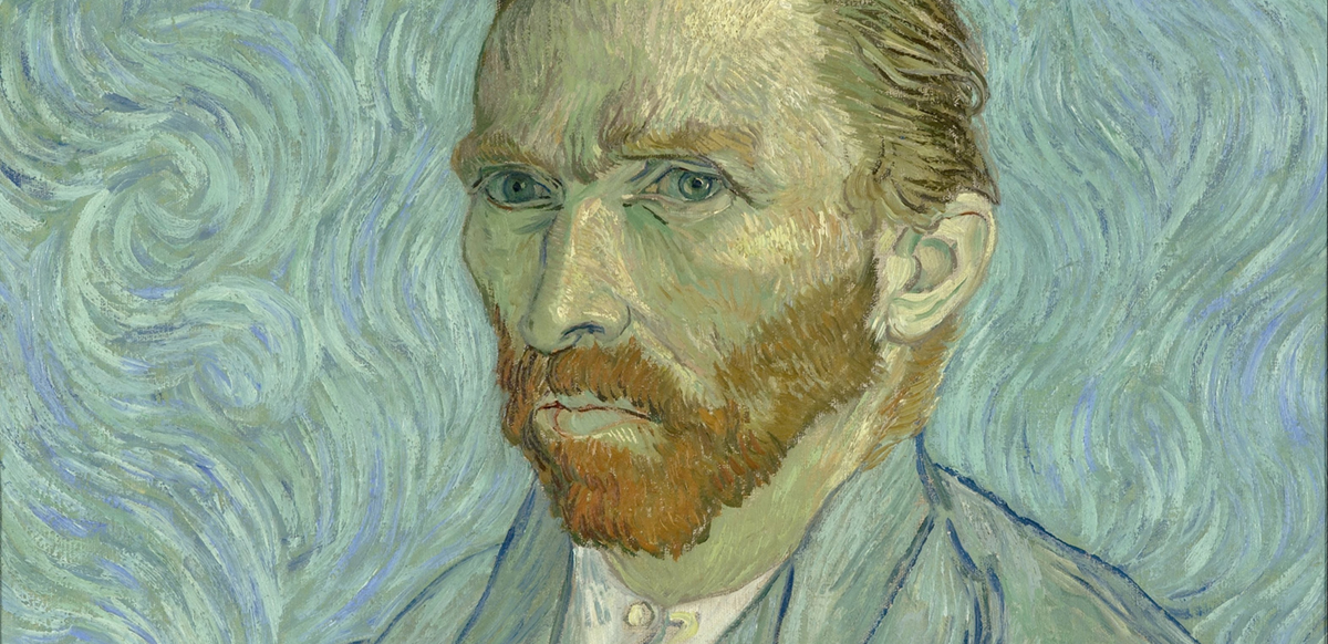
Last month in Canada Automattic had its annual meetup reunion. I did a short talk on some of my favourite passages from Van Gogh’s letters.
Vincent often represents the paradigmatic idea of the tortured artist, whose work is seen both as the brilliant deliriums of a madman and yet inconceivable without some kind of mental distress. It is portrayed as the great result of an illness. I believe such a vision does an incredible disservice to his work, his creative genius, and his suffering.
We have the privilege that a vast collection of his letters — mostly sent to his brother Theo — have been preserved. One of their most striking aspects is the great insight, eloquence, knowledge, serenity, and awareness that he displays in them. The evolution of his style follows a determination to find beauty and a very precise artistic expression.
All kinds of eccentric and bad things are thought and said about me, which makes me feel somewhat forlorn now and then, but on the other hand it concentrates my attention on the things that never change — that is to say, the eternal beauty of nature.
The Hague, 1882
At a time that art theory recognises as the birth of the avant-garde movements, it’s wise to recall that the artists weren’t necessarily seeking novelty, but often instead trying to return to a sense of purity and directness in their contact with the world that may had been forgotten by art.
What am I in the eyes of most people — a nonentity, an eccentric, or an unpleasant person — somebody who has no position in society and will never have; in short, the lowest of the low. All right, then — even if that were absolutely true, then I should one day like to show by my work what such an eccentric, such a nobody, has in his heart. That is my ambition, based less on resentment than on love in spite of everything, based more on a feeling of serenity than on passion. Though I am often in the depths of misery, there is still calmness, pure harmony and music inside me.
Van Gogh tried — unsuccessfully — to create a community of artists in southern France with the purpose of working together in the pursuit of great art. An intrinsic obstacle for this effort was, in his mind, the inability of artists to collaborate:
However, I shan’t labour the point, because I realize that life carries us along so fast that we haven’t the time to talk and to work as well. That is the reason why, with unity still a long way off, we are now sailing the trackless deep in our frail little boats, all alone on the high seas of our time. Is it a renaissance? Is it a decline? We cannot judge, because we are too close to it not to be deceived by distorted perspectives.
He often writes with close attention about the works of other masters. The following is a great description of Rembrandt, for instance:
This is how Rembrandt painted angels. He does a self-portrait, old, toothless, wrinkled, wearing a cotton cap, a picture from life, in a mirror. He is dreaming, dreaming, and his brush takes up his self-portrait again, but this time from memory, and the expression on the face becomes sadder and more saddening, He dreams, dreams on, and why or how I cannot tell, but — as Socrates and Mohammed had their guardian spirits, so Rembrandt paints a supernatural angel with a da Vinci smile behind that old man who resembles himself.
And finally, the impulse behind a sense of purpose constantly emerges from his writing; a sense of figuring out what was important to him and how to develop his craft towards his ideals.
On the road that I’m on I must continue; if I do nothing, if I don’t study, if I don’t keep on trying, then I’m lost, then woe betide me. That’s how I see this, to keep on, keep on, that’s what’s needed. But what’s your ultimate goal, you’ll say. That goal will become clearer, will take shape slowly and surely, as the croquis becomes a sketch and the sketch a painting, as one works more seriously, as one digs deeper into the originally vague idea, the first fugitive, passing thought, unless it becomes firm.
What changes in our historic perception of art when we imagine the Parthenon in its former colourful glory — embellished with blues and reds and painted friezes — instead of the desolated white ruins we sight today? Time seems to add a layer of distance to ancient art, of spurious reverence towards their so long thought immaculate presence. For a large part of our history both Greek and Roman sculptures and architecture were considered to have been created in this pristine candidness of idealised purity, so often emulated in neoclassical times. It is now widely recognised that instead of the pure white reality we see today they were instead covered with the splendour of colour. Sadly, it’s something we cannot regain and may at best simulate with the tools we have for the benefit of our imagination and interpretations.
Yet, such shift in our understanding of the use of colour is not only important for archeological and art history reasons, but also because they shape our sensibility and development — how we understand colour through art history is part of our aesthetic legacy and commitment to truth. 1 Our understanding has a direct impact in our rendition of the past, and our use of it in the present.
Much later in history, in the domain of painting, we also face similar challenges. It’s only recently that we have the tools necessary to truly inspect the layers, materials, and pigments that paintings were made of. Research has indicated that the background in the Girl with a Pearl Earring by Vermeer is composed of a transparent layer of indigo mixed with weld over a dark black underpainting. This would have looked originally like a deep dark greenish background instead of the almost plain black we can see now. That is before the degraded composition of the paint and the fading of colours as they react to light occurred. The same is said to have happened with certain pigments in something as fresh in history as Van Gogh’s work, where chrome yellows have lost intensity and other pigments faded due to their poor lightfastness. 2
Besides the natural tendencies of certain pigments to fade and change through time, there’s also the use of varnishes of several kinds, often applied years or centuries after the works were finished by new owners, restorers, and conservationists, with various effects in the final colour rendition and overall tone of the painting. This becomes particularly evident with the often controversial cleanup works carried these days by restorers that seek to chemically remove spurious layers of varnish and overpainting to bring the works closer to their original condition. Museums have different policies regarding the extent to which they are willing to attempt the removal of the varnish layers and dirt that obscure the original paint without risking damaging the work itself.
An example of how dramatic the result could be can be seen in the restoration of Danae and Venus and Adonis by Titian carried by the Prado Museum in Madrid. In the case of Titian, his use of colour (with access to a wide range of pigments in Venice during the high Renaissance) is well documented, the quality of his flesh tones remarked by many contemporaries and artists through history. The condition of the work before restoration was but a pale impression of the artists intention. Another important aspect of validating these restorations is the contrast some of the works have compared to other contemporaries that used the same pigments and techniques, yet for various reasons were not varnished as aggressively or better preserved in general. Sometimes (even better) this reference comes from other works by the same painter or within his workshop.
Before restoration
After restoration
Paintings by Leonardo da Vinci are scarce and often in delicate shape. Titian is estimated to have painted around 400 works of which around 300 survive; this is a stark contrast with Leonardo’s body of pictorial work, which gives even less room to make comparisons within his opus to determine the tonal qualities and guide restoration processes. Yet, the judicious comparison with other Renaissance artists, the insight into the process as well as the materials used — not to mention his own reflections in his Treatise on Painting when he writes about colour or the blueness of aerial perspective — all give a frame of reference. It’s not a daring error to think that when it comes to the great Leonardo da Vinci we have but a glimpse of his outstanding work. 3
A few years ago there was controversy when the Louvre restored The Virgin and Child with St. Anne, one of Leonardo’s latest paintings, removing the obscuring impression the brownish patina had in the work. There was a wave of reactions with mixed impressions, hard as it is to separate truth from personal estimations of what makes a Leonardo picture, there’s no consensus when it comes to clashing sensibilities and the notion of what a Leonardo “should be”. The restored luminosity and richness in colour is comparable to the often visceral rejection the coloured Greek sculptures and buildings produced in the collective mindset when they came to light. To many people, Greek sculptures should have remained white and “pure”. Outside of legitimate concerns over solvents damaging the extraordinarily delicate blending technique of Leonardo should they be too aggressive, it’s also true we have gotten used to seeing these masterworks through the faded patina of earthy tones, varnishes, and dirt that the striking resurgence of colour from below is often met with initial repel and unfamiliarity.
Before
After
Yet this effort is crucial to bring such a treasure of humanity to clear sight. Mastering colour, mastering its subtleties, its power for reaching sublime balances is something only few achieve. In the history of painting those that achieved it stand as giants. Leonardo da Vinci certainly was one — as he was a master in everything he set himself to do. It is a very unfortunate reality that today it is perhaps one of the hardest things to appreciate in his remaining paintings due to the ageing, layers of oxidized varnish, and mistreatment applied to the works throughout time and their various possessors. Our sensibility gets used to the current perception of it, and we risk doing a disservice to his work when we distort them by leaving them as they are.
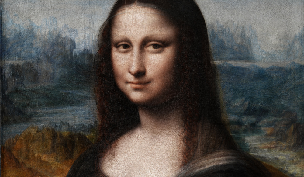
Which brings us to the Mona Lisa. This is a rather accurate photographic representation of the state in which we can contemplate it today. Its former glory perhaps forever lost to us outside of imagining, as we compare the work with other contemporary pieces of similar techniques and pigments, how it could have looked like to its contemporaries.
The Mona Lisa, by Leonardo da Vinci.
However, with recent good fortune, we have the unforeseen perspective given by a remarkable discovery, a feat for the academic world of art history. It was not a discovery of a painting but a re-discovery of a Mona Lisa copy, which previously had the background completely covered in dark paint and was considered to be a later copy of not much value held in the vaults of the Prado Museum in Madrid. Restoration processes carried by the museum allowed for the original landscape to come into sight. And what a sight it was! It unveiled the magnificent landscape, mountains, lapis lazuli sky, earth tones, greens and reds of the dress fabric, and the flesh tones of the model. A copy of remarkable quality in how well preserved it is and faithful to the original. Since it’s suffered a much less eventful life than Leonardo’s work, the colours have remained much closer to being intact.
Restored Mona Lisa copy at the Prado Museum, Madrid.
This copy gives us a unique glimpse into a lost quality of one of the most significant artworks of humankind. By looking at it, while lacking the grace of form, shape, and subtle lightning from the hand of Leonardo himself, the observer can still get an idea of the colour magnificence and overall splendour of shape and light the original work may have had. That is enough to captivate the mind. The exercise of transporting such colours into the Louvre’s work is daunting and exhilarating at the same time — it makes the work live in our heads, still able to inspire from behind the yellow-brownish surface of its present reality.
The restoration work also involved meticulous analysis of the underpainting which, according to the studies, have shown pentimenti of the same kind in both the original Leonardo masterpiece as well as the Prado copy. Infrared reflectography showed there were remarkable coincidences in the underdrawing, with common lines traced perhaps from a shared cartoon. There were corrections applied to this initial transfer by the master that were also present in the Prado copy, following the same process. All of this seems to eloquently convey that both works were painted together at the same time, perhaps by one of Leonardo’s pupils or followers working in his workshop, closely replicating what the master was doing.
It’s tragically impossible for us to appreciate the original work in its purest and intended form — we can only piece together its authentic beauty from different sources and through the will of our imagination. The Prado version is thus an invaluable reference. Maybe some day, by the evolving craft of our aesthetic archeology, we can piece this work together in a more excellent way, above the distant depiction behind a glass at the mercy of a thousand uncaring flashes in the Parisian museum.
The following is a reconstructed digital visualisation, made by myself, of what Leonardo’s work could have looked like using the colours from the Prado copy:
Digital reconstruction of colours in Leonardo’s Mona Lisa.
Notes:
Also an encouragement to reflect on the role of colour in our crafts. From the current trends in filmmaking falling into an uninspired combination of teal and orange, to the excesses of advertising that populate cities, sometimes robbing them mercilessly of their beauty. ↩
How aware of these phenomena were the artists themselves (considering sometimes it took years for these processes to develop), or whether it was employed knowingly to achieve a later effect, remains an open question, of course, though it seems a bit intellectually capricious. ↩
Raphael’s work itself, as an example, contrasts in terms of luminosity and colour with the Florentine master quite remarkably in the best preserved paintings. ↩